World GIS Day 2022
Share
Happy GIS Day!
The use of GIS and its influence in our day to day lives has grown massively over the last 15-20 years and is now at a point where it is everywhere we look, and we may not even notice.
The heat charts we see on Match of the Day to show how hard your favourite players have worked to the ability to locate our friends’ locations on platforms such as Snapchat is all underpinned by geospatial information.
One of the earliest examples of maps and data working hand in hand to solve a modern-day issue was during the Cholera outbreak in London in 1854, the outbreak killed over 600 residents. Dr John Snow was a physician from York who took it upon himself to investigate further the cause of the outbreak using mapping and data analytics. He plotted each case and represented them as a bar at each location, the more cases the bigger the bar. What he soon realised was that most cases centred around the water pump on Broad Street.
At a brewery local to Broad Street, it was surrounded by cases but appeared unaffected, it is believed the workers where allowed all the beer they could drink so had no need for water! It was decided that the pump in question would be switched off and cases monitored on a regular basis. The cause was eventually identified as a contaminated nappy dumped in a nearby pit that was linked to the pump.
Modern day GIS is used throughout everything we do at Ardent. We have integrated our mapping and data into the Atlas database to give our users the ability to use mapping to benefit their own work. We are developing and using mobile data capture applications to conduct our site survey work and to collect important information in a manner that is accessible and able to be analysed. Visualising data in the form of interactive and intuitive dashboards is helping monitor the performance of certain aspects of a project and can be used to identify trends and patterns.
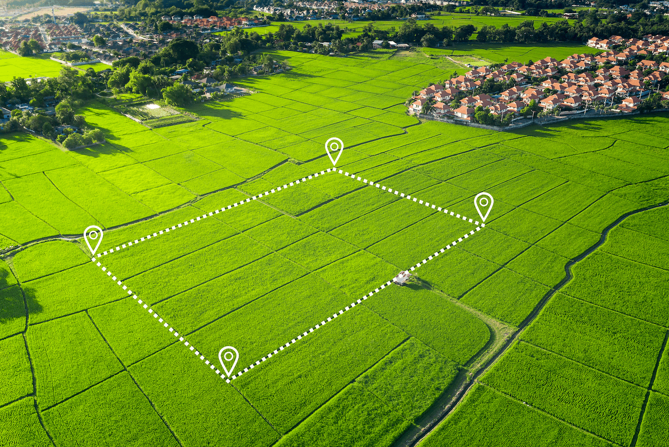
We are only scratching the surface of what is possible, the technology and data available today means we can use geospatial data however we need to in order to add value to the work we do. We are currently looking at ways we can support our renewables clients in automating site selection and optioneering in order to use the data and applying rules and criteria to help suggest potential development sites.
Here are some links to examples of how information is being presented in a manner that is easy to understand and allows the user to explore the data behind the work:
Story Maps
· A Virtual Tour of Washington’s 21st Century Infrastructure (arcgis.com)
· Marvel Superhero Origins (esri.com) – one for the comic book fans!
Dashboards
· Tax Incremental Finance Project Areas (arcgis.com)
· Iniciativas de conservación y producción sostenible en la Orinoquía (arcgis.com)
· Cumulative Statewide Power Outages (Public View) (arcgis.com)
If you have any questions, please get in touch with adamhankinson@ardent-management.com


